Go Team!


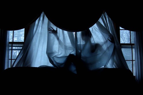
 For this project we got to choose what we wanted to do. I chose to depict the life of a runaway. I like the way this picture turned out.
+copy.jpg) The theme for this photo was, "Photos in a Magazine." I really enjoyed this photo because it shows movement and i just like the overall composition of the photo.
The theme for this photo was, "Photos in a Magazine." I really enjoyed this photo because it shows movement and i just like the overall composition of the photo.
+copy.jpg)
.jpg) As senoirs spend the last days of high school, friends realize that they will part very soon. I took this piture accidentaly; I just took a random picture. In my case, it became a successful picture. The two friends have that space between them, indicating that soon they will part. I didn't realize the foot in the backround, it caught the ghost effect; I think it was perfect for the parting, almost like disapearing.
As senoirs spend the last days of high school, friends realize that they will part very soon. I took this piture accidentaly; I just took a random picture. In my case, it became a successful picture. The two friends have that space between them, indicating that soon they will part. I didn't realize the foot in the backround, it caught the ghost effect; I think it was perfect for the parting, almost like disapearing.+copy.jpg)
+copy+3.jpg)
.jpg)
.jpg) I took this picture of my moms teapot, for the reflections project in class. My mom is a collecter and i find them very intersting.I wish the picture was a little less blurry. Other than that i think the picture is fairly unique.
I took this picture of my moms teapot, for the reflections project in class. My mom is a collecter and i find them very intersting.I wish the picture was a little less blurry. Other than that i think the picture is fairly unique..jpg) I took this picture of a reflection of trees in a big puddle. I photoshoped it by changing the color and made it a little more clearer. I also fliped the photo upside down.
I took this picture of a reflection of trees in a big puddle. I photoshoped it by changing the color and made it a little more clearer. I also fliped the photo upside down..jpg) For this project I had a bit of a hard time trying to position the globe in the right way so the sun would be reflected on it. I found the spot of sunlight where it reflected on the wooden table. I think this picture was the most successful of the 24 reflection pictures I took. I like how there's a small reflection in every little bubble of the globe.
For this project I had a bit of a hard time trying to position the globe in the right way so the sun would be reflected on it. I found the spot of sunlight where it reflected on the wooden table. I think this picture was the most successful of the 24 reflection pictures I took. I like how there's a small reflection in every little bubble of the globe..jpg) In this photo, I attempted to portray the topic of “negative space”. To the right side of the picture, is a leg hanging down from a body sitting upon a stool. In various areas surrounding the feet there is negative space. Especially the areas near the bottom of the feet; there is also negative space. In addition, the left side also features a bit of dept in the background. This forces the eye to travel, as this area is also occupied by negative space. I particularly like the lighting in this photo. The main subject in the foreground is the most vivid. Portions of negative space in the background are also very vivid.
In this photo, I attempted to portray the topic of “negative space”. To the right side of the picture, is a leg hanging down from a body sitting upon a stool. In various areas surrounding the feet there is negative space. Especially the areas near the bottom of the feet; there is also negative space. In addition, the left side also features a bit of dept in the background. This forces the eye to travel, as this area is also occupied by negative space. I particularly like the lighting in this photo. The main subject in the foreground is the most vivid. Portions of negative space in the background are also very vivid. Kayla Volpe "Water Flowing Out of the Faucet"
  Kayla Volpe "Darkened Hand and Rock"
 Indigo Vigotty "Looking Away"
 Indigo Vigotty "Hiding Fence"
 Vianca Lugo "81 Abeel Street"
  Katherine Solomon "Self Portrait"
  Skyler Onderdonk "Ocha"
 Sarah Kaplan "Womb"
 Krista Arena "Rudy Can't Fail"
 Mike Yalamas "Ice"
 Mike Yalamas "Entrapment"
 Katherine Solomon "Barber Shop Penny"
 Kirsten Fraude "Colored Pencils"
 Rebecca Hellard "Paint Brush"
 Rebecca Hellard "Spokes"
 Dana Pistone "Untitled"
 Dana Pistone "Self Portrait"
Amanda Yaple "Untitled"
.jpg)
 I feel this photo is a success because it captures the feeling of happiness. I like that the puppy is up close in the foreground and that as you look back it's body fades.


 This is a picture i took outside because the lighting was so much better. The sky in the backround is a solid color is negative space so it helped bring more focus onto me.This was one of my photos that i really like.
 I chose this photograph because I like how she looks as if she is focused on something else or it's almost as if someone has her attention. I like how the light in this picture isn't to bright or to dark and it doesn't affect the photo.


 When I took this picture i didn't really think that it was that interesting. But as I learned more about photoshop, I started to play around with the settings and the end result is what you see now.